|
This post created by ignored player and thus hidden.
Double click to show.
|
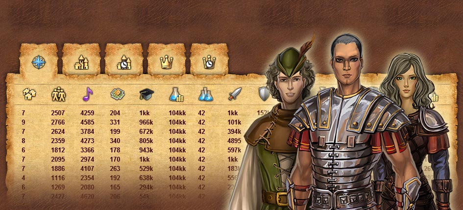
Since the launch of Alpha 6 we have been working primarily on the long-needed interface overhaul, and today we are launching the first pack of changes. We had already added some minor changes in earlier updates, (like the new upgrade confirmation screen and information panel at the bottom of buildings), but today it is a complete overhaul of what is inside your town. So what exactly has been changed? - Build Menu - This is a long awaited change. Now it is more than just a build menu. It's also a convenient summary screen of all buildings you have in your town. It shows what is present and what is not, levels of buildings, their quantity, includes the ability to quickly locate a necessary building, and so one. Hopefully you will enjoy this. Now you will see why the building button has been moved to the right side.
- Minimap - Have you ever struggled to find lumber income buildings to upgrade them in the new town and instead clicked on stone or iron or food building first before locating the lumber? Well, not anymore. The new minimap helps distinguish one from the other. It may look overloaded at first, but you will get used to it and will find it quite helpful. It shows all the interesting stuff - idols, puzzles, monsters, chests, NPCs and so on. The minimap will also be bigger in the future, so those icons will be even more prominent.
- Buttons Style - Hopefully these are now more streamlined and noticeable, thus easier on the eyes.
- Building panels are gone - There are now brief details underneath the building, and control panel above a selected building, with a detailed info screen about the building when you click question mark button. The new design allows you to order units, upgrades, petroglyph tasks, and so on - with less clicks.
- Unit order screen - I have previewed the new unit order screen on twitter, but now you can actually try it. It allows you to order multiple units in one go.
- Upgrade order screen - This is similar to the unit order screen, but very helpful in showing which upgrade applies to what kind of units before you order it.
Keep in mind - while this is a whole lot of changes - this is far from what we actually plan to do. There is a world map screen which needs even more work, but even the town screen is only partially reworked. We will be adding further improvements as well. The update is rough and untested so make sure you report all bugs. Let us know what you think about these changes in the comments below.
|
|
This post created by ignored player and thus hidden.
Double click to show.
|
|
|
I think old menu was more nice but it too so good |
|
|
|
|
This post created by ignored player and thus hidden.
Double click to show.
|
|
|
I like the clean look, buttons are good and the easier way of updating tasks is less of a hassle. The only thing so far that I can't sort is what my building time is in percentage of the standard. I used to click on a house and it would say 70% or 140% etc. Where is that information now? |
|
|
|
|
This post created by ignored player and thus hidden.
Double click to show.
|
|
|
Thoroughly approve today's update. The old build menu drove me nuts with the lag but I do really like the new menu, you can see everything in one place. The new order troops/explorers button is an excellent update so much easier to order replacements in one go, the only downside I can see is that you can no longer see if the explorers are exploring or returning to your town, I did like to see my little guys feet marching, I also used to hover on the explorer to see if I needed to retrain any so by the time my group got back I had already retrained the replacement so the could go out again immediately. The mini map upgrade is very helpful too, rather than scroll around you can see everything at a glance, visitors, chests, dig spots so its just one click to get there Thanks Devs top job :-) |
|
|
|
|
This post created by ignored player and thus hidden.
Double click to show.
|
|
|
I like the clean look, buttons are good and the easier way of updating tasks is less of a hassle. The only thing so far that I can't sort is what my building time is in percentage of the standard. I used to click on a house and it would say 70% or 140% etc. Where is that information now?
You stil click on the house and it's under the house. |
|
|
|
|
This post created by ignored player and thus hidden.
Double click to show.
|
|
|
I also used to hover on the explorer to see if I needed to retrain any so by the time my group got back I had already retrained the replacement so the could go out again immediately.
Pay attention on the progress-bar on panel of barracks-type buildings. It shows how many slots does it have, green color means slot is occupied, grey one means it's empty. If there are empty slots you can train units. |
|
|
|
|
This post created by ignored player and thus hidden.
Double click to show.
|
|
|
Great changes! Will take a little getting used to, of course, but much more user-friendly and better-looking, too. Good job! |
|
|
|
|
This post created by ignored player and thus hidden.
Double click to show.
|
|
|
I like everything except the new buttons. I liked the old ones better and I think they matched the look of the game more. |
|
|
|
|
This post created by ignored player and thus hidden.
Double click to show.
|
|
|
g Great job! Many good improvements. Love the map, used to mark all usefull things on paper, LOL! Multiple order is very useful, was at times annoying to click each one separately, when you wanted to go full capacity. Buttons look modern now, though I kind of enjoy all "totem" look, I hope the nice stone edging, like around this forum or tabs in the game, will stay.It could in fact reflect the age your hero is in. Build menu is great, but maybe a bit more contrast is needed to clearly see what you have and what you can build, now all looks equally dull. While building has improved, I find that downgrade/destroy meny is longer to reach - you first have to locate the building,then click on "?" and only then can choose to destroy it (or am I missing something?) could be located somewhere directly in the build menu. |
|
|
|
|
This post created by ignored player and thus hidden.
Double click to show.
|
|
|
I really appreciate the fact that we can now train all units by numbers instead of clicking on each . I like the look of it all. But why did you change the deep blue of alliance members to light blue? Dark blue was easier on the eye lol. |
|
|
|
|
This post created by ignored player and thus hidden.
Double click to show.
|
|
|
Love the new update and minimaps :) Just curious though, all the resources are marked on the minmap except for the oil spots? Was this intentional? |
|
|
|
|
This post created by ignored player and thus hidden.
Double click to show.
|
|
|
Love the new update and minimaps :) Just curious though, all the resources are marked on the minmap except for the oil spots? Was this intentional?
They are not marked because you have not researched oil yet. |
|
|
|
|
This post created by ignored player and thus hidden.
Double click to show.
|
|
|
I really appreciate the fact that we can now train all units by numbers instead of clicking on each . I like the look of it all. But why did you change the deep blue of alliance members to light blue? Dark blue was easier on the eye lol.
Because it's not just borders, but also town names are of the same color. Town names are more important and more readable now. |
|
|
|
|
This post created by ignored player and thus hidden.
Double click to show.
|
|
|
Well what I can I say about this update?Quite simply awesome. Thank you very much for this. Some bits to get used to in order to erase the muscle memory but bravo
Edited 30 seconds later by TheTraveller.
Reason: formatting incorrect.
|
|
|
|
|
This post created by ignored player and thus hidden.
Double click to show.
|
|
|
I trust you will continue to work on the look and feel, but the overall interface advancements in terms of usability are nice. A couple of bits of feedback: 1. the buttons are in your face. they are too loud and the margins should be reduced to give a more refined subtle feel since you made a definite move away from the "rustic" look. 2. The "ordering troops" no longer shows you the "mix" of troops that you already have. Say for example, you are at the Garrison and want to train a Legionary. I don't have a good way of seeing how many legionaries I've trained at this location (or more importantly in general across all my towns). Having this management insight would help with determining which unit and quantity to train. 3. Hope something similar to the build menu is in the works for the inventory 4. Hoverovers are nice but not fully implemented. Some of the buttons and minimap legends are not self-evident All in all I like the usability progress, keep it up. As this is still an alpha I felt entitled to add my thoughts...take 'em or leave 'em. |
|
|
|
|
This post created by ignored player and thus hidden.
Double click to show.
|
|
|
Love the new update and minimaps :) Just curious though, all the resources are marked on the minmap except for the oil spots? Was this intentional?
They are not marked because you have not researched oil yet.
Aww..well that just makes far too much sense, ty :) As said before, love everything about the update so far, but could i possibly make a tiny suggestion? When you click on the military building to train new units, right now, the icons for units to train either has a grey border (can't train unit), or a darker tan border (can train unit). The darker tan blends in a bit with the panel it's on, so would it be possible to change the backgrounds on the icons to green and red? or even just a light green if you can train a specific unit, just so it stands out a bit more. |
|
|
|
|
This post created by ignored player and thus hidden.
Double click to show.
|
|
|
Functionality is fine and improved. I know in the future you'll add the beautiful designs of buttons and type face that are simply gorgeous on many Enkord games, as you've never published anything that looks dry and technical. |
|
|
|
|
This post created by ignored player and thus hidden.
Double click to show.
|
|
|
I love the mini-map add-ons. Trying to find all the monsters in my towns was always frustrating for me. So a big thankyou from me |
|
|
|
|
This post created by ignored player and thus hidden.
Double click to show.
|
|
|
2. The "ordering troops" no longer shows you the "mix" of troops that you already have. Say for example, you are at the Garrison and want to train a Legionary. I don't have a good way of seeing how many legionaries I've trained at this location (or more importantly in general across all my towns). Having this management insight would help with determining which unit and quantity to train.
Click on the unit building, and click the question mark. I was a little confused at first as well. I think the new update is very impressive, great work. |
|
|
|
|
This post created by ignored player and thus hidden.
Double click to show.
|
|
|
Like most of the new things.Especially how the game is working much smoother again.One little suggestion though.Minimap could do with a little less.It can be overwhelming like it is now with all them icons.Telling were travellers,monsters and chests are would be sufficient enough i think.Fields,fishingspots and digsites are too much. |
|
|
|